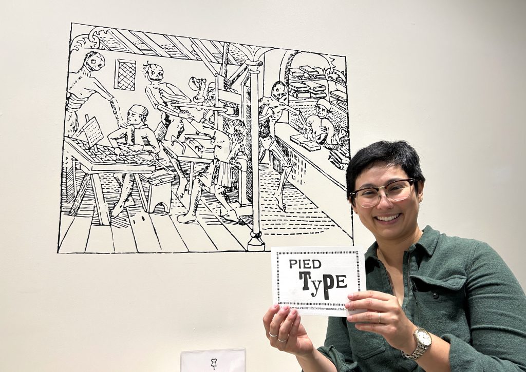
Don’t miss the exhibition up now at the Providence Public Library. Curated by artist and printmaker Lois Harada, “Pied Type” features materials from the library’s Updike Collection, the Tomaquag Museum, the Rhode Island Black Heritage Society, and the Rhode Island Historical Society, as well as works from AS220, DWRI Letterpress, and artist Jacques Bidon.
Pied Type: Letterpress Printing in Providence, 1762–Today is an exhibition highlighting the robust history of commercial printing in Rhode Island. In a printshop, pied type refers to jumbled or unsorted letters—usually created by accidentally dropping or spilling metal type. The exhibition will reveal the various roles of craftspeople in the letterpress printing process and delve into the techniques and equipment still used by contemporary printers in Providence today.
Pied Type will feature materials from PPL’s Updike Collection, Tomaquag Museum, RI Black Heritage Society, and Rhode Island Historical Society, as well as works from AS220, DWRI Letterpress, and artist Jacques Bidon.
Lois Harada is an artist and letterpress printer based in North Providence. She has worked in commercial printing for over a decade. She also teaches letterpress printing at Rhode Island School of Design. Her studio is in Providence, and she incorporates letterpress printing, etching, and silkscreen printing as part of her artistic practice. (Visit her Instagram to see more of her work.) There is a lot to see in this exhibition, and people not in the letterpress field will learn a lot.
This used to be a rather narrow area of interest — typography was never discussed in my family when I was growing up — but with the advent of the home computer, we all became obsessed with fonts. Since then there has been a resurgence of interest in fine letterpress printing carried out by artists with modern sensibilities and talents using those glorious old printing presses.
The exhibition includes fascinating old sample books, ephemera, equipment, and advertising. What I had not expected were the window treatments! Ms. Harada was kind enough to answer some questions. The following comments were lightly edited for clarity:
PDD: The sheers in the windows, did you print those? And where did you print those?
LH: I teach in the Graphic Design Department at RISD and they have a pretty amazing resource in their type shop, so Julie Gualtieri and Ed Brown kindly helped me print those out. So those sheers are taken from the sample book that the Providence Journal had which is in one of the cases. So those advertising fonts, you would have said, “I’m advertising in the ProJo . . . I’m going to chose this type face and this type face” and go from there. So I wanted to blow those up because the curtains have to stay down in the gallery, because everything is so much older than a lot of the contemporary material. So I had to keep the natural light out, and I wanted to give it a little more texture.
PDD: What’s the fabric?
LH: It’s an organza.
PDD: If someone fell in love with these, could they hire you to do a similar project?
LH: Sure, or if you just reach out to me in January you can just take those panels. I didn’t hem all the sides . . . those were so slippery to sew!
*******************************
The exhibition will be on view during regular library hours through January 11. Don’t forget to check out the ground floor restaurant CHOP while you are there.
Providence Public Library, third floor, 150 Empire Street, (directions)
*******************************

I feel like some business or interior designer could do something with printed panels like this. I really like them.

Some of these books read like modern poetry.